From Prompt to Produc t
App design •AI-Tools • chatgpt • lovable • Supabase

About
Goal
When I moved to Chicago in late 2024, I quickly realized how overwhelming the city’s food scene was. Yelp felt repetitive, Instagram was overly curated, and Google Maps made everything look the same.
I wanted something fast, visual, and fun — an app I could actually use to explore the city on nights out, date nights, or when friends visited.
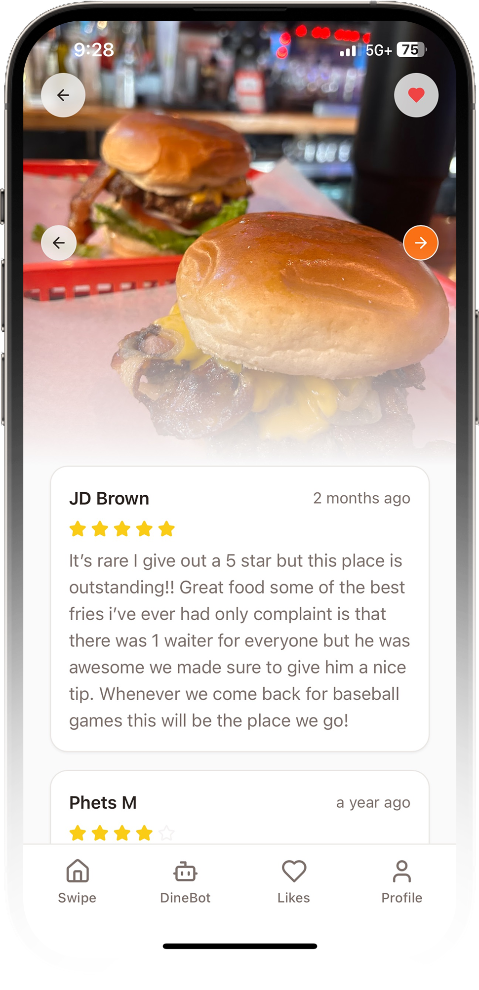
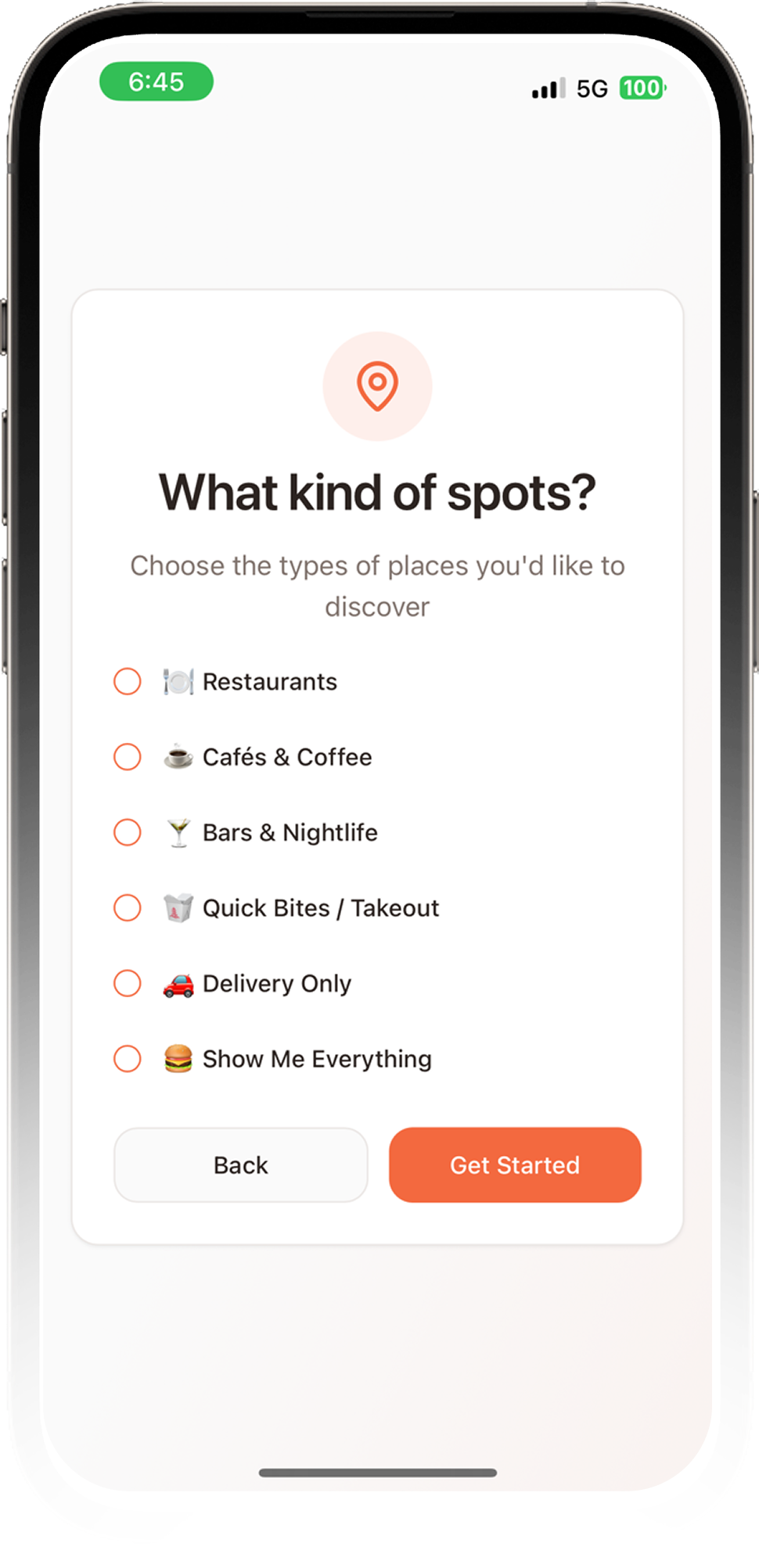
So I built DineSwipe, a Tinder-style restaurant discovery app designed for new locals like me. Instead of scrolling endless text, you swipe through restaurants by vibe, photos, and recommendations. Save what you like, build lists, and share them with friends.
It started as the app I wished existed when I arrived in Chicago — and now it’s live in the iOS App Store for everyone else too.
To build it efficiently, I combined:
✅ ChatGPT for UX flows, prompts, and technical planning
✅ Lovable for rapid UI generation + code scaffolding
✅ Supabase for auth, favorites, lists, and restaurant data
✅ GitHub + Xcode for full iOS deployment
✅ The Chicago food scene for inspiration

Built for Real Use, Not Just Exploration
I went through the full product lifecycle to bring DineSwipe to market—from defining UX flows, wireframes, and core features to structuring Supabase tables for users, restaurants, lists, and favorites. I used Lovable to generate the initial UI and refined the interaction patterns manually, then tested the app on-device and iterated until the experience felt right. From there, I prepared all App Store metadata and screenshots, configured Xcode builds, provisioning profiles, and TestFlight, and worked through the Apple review process. After final approval, I launched DineSwipe publicly as a polished v1.0 release. Even though the app was built quickly with the help of AI tools, every decision was made with real user needs in mind.

Fixing the Pain of Google Maps Panning
Before building DineSwipe, I noticed a consistent pattern: people were endlessly panning around Google Maps trying to discover restaurants. They zoomed in, zoomed out, opened tabs, closed tabs, and constantly lost track of places they liked. It was slow, tedious, and completely broke the flow of discovery. That friction became the foundation for DineSwipe. I wanted to replace the heavy, manual map-scrolling routine with a simple, visual, swipe-based experience that made finding places feel natural instead of like work.


Designing the Core Experience
The core DineSwipe experience needed to be fast, intuitive, and gesture-driven. Users swipe right to save a restaurant, left to skip, and up to view details. While Lovable produced the initial layout, I put extensive effort into refining how each gesture felt. I tuned the responsiveness of the swipe, the smoothness of card stacking, the behavior of transitions, and the color and theme consistency across light and dark modes. By testing the app in real contexts—walking around neighborhoods, checking places before dinner, and exploring new areas—I ensured the interactions felt effortless and natural.


Lists, Favorites, and Sharing
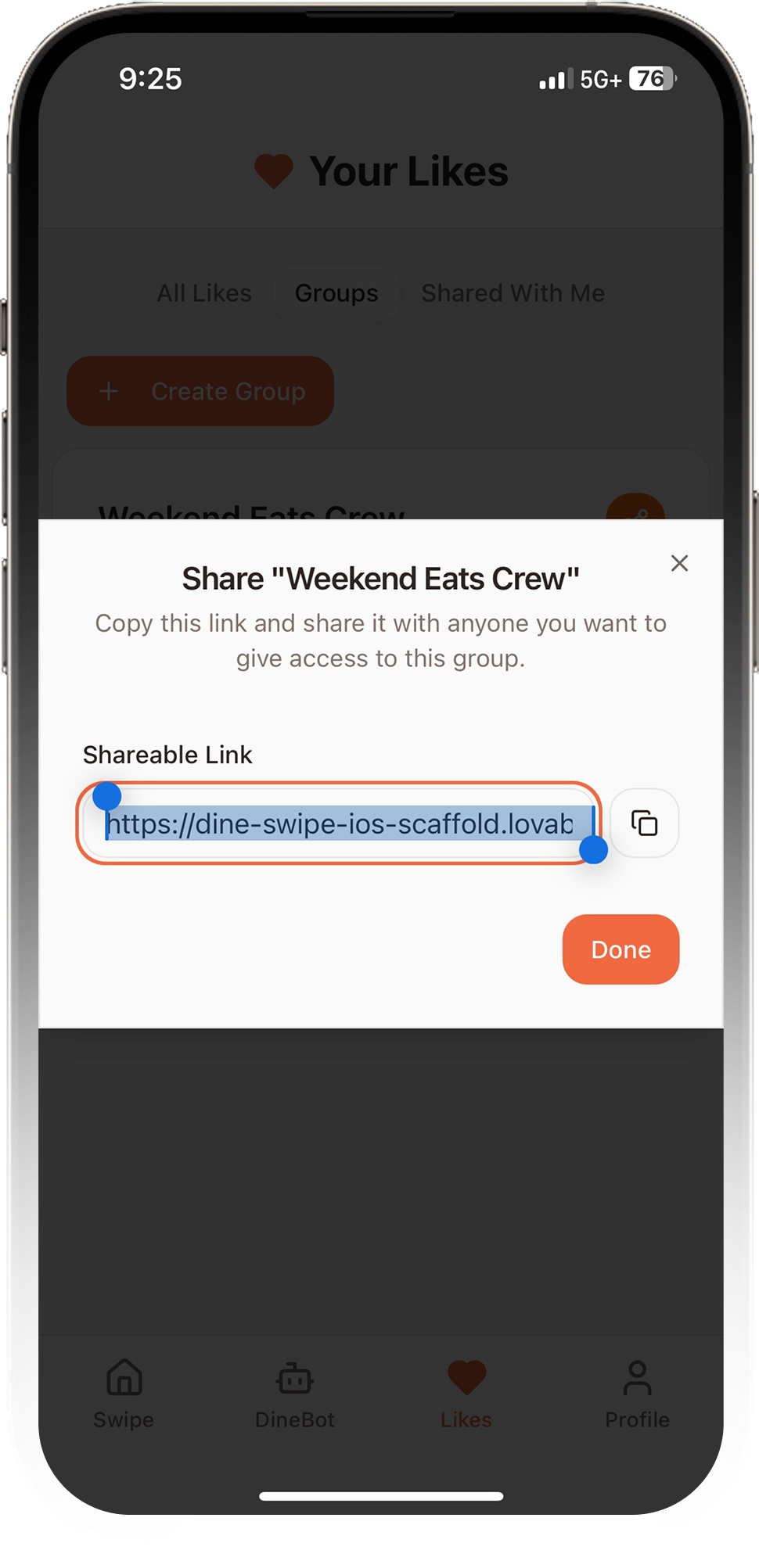
Once the core swipe experience felt strong, I expanded the app to support more practical, everyday needs. I wanted a way to categorize restaurants around Chicago—brunch ideas, places to take friends, cocktail bars, neighborhood spots, and more. To support this, I built a flexible list system where users can create lists, save matched restaurants into them, reorder items, access favorites instantly, and share lists with friends. These additions turned DineSwipe into a genuine planning tool rather than just a discovery interface.


Meet DineBot — Your AI Taste Finder
DineBot uses OpenAI to turn simple, natural language input into restaurant recommendations that match the user’s vibe. Instead of searching through categories or menus, users can just describe what they’re feeling—“cozy date spot,” “late-night tacos,” “somewhere with killer cocktails,” etc. DineBot analyzes the prompt, matches it against the restaurant data in Supabase, and returns curated picks that feel personal and intentional. It transforms discovery from a search task into a quick conversation, making the app faster, smarter, and more aligned with how people actually choose where to eat.

Where Product + Design Became One Role
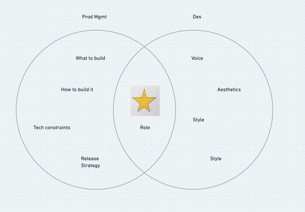
Building DineSwipe blurred the line between product management and design in the best way possible. I wasn’t just defining what to build—I was also shaping how it should feel, how it should work, and how it should ship. Every decision sat at the intersection of user experience, technical constraints, and release strategy. I was the one writing requirements, planning the data model, designing interactions, refining UI patterns, coordinating builds in Xcode, and prepping for App Store submission. On this project, the PM hat and the Designer hat weren’t two jobs—they were the same job, merged into a single, end-to-end role that owned the product from concept to launch.

Hungry for What’s Next
Launching DineSwipe wasn’t just another side project—it was proof that AI-accelerated product design can ship real, polished products into the world. I built something I actually use every day, and now that it’s live, I’m more excited than ever to see how AI continues reshaping the way we design, build, and launch apps. This project was the appetizer. The AI landscape is moving fast, and I’m ready to keep eating it up—experimenting, iterating, and serving up whatever comes next.

