Unlocking Incrementality
digital marketing ui/ux • User Research • design system • responsive ui

About
Role
Since 2017, Measured has been helping customers unlock the true value of their online marketing campaigns. However, by early 2023, its full-service model began to show signs of wear, and interest shifted toward expanding its offerings into a more comprehensive full-service solution. An AdTech B2B marketing analytics software for digital marketers, Measured’s mission is to provide data analysts, portfolio managers, and channel managers with the true value of their digital marketing.
I collaborated with the VP of Product Design and a Product Manager on strategy, leading the design execution of the homepage and the entire Measured dashboard for one of the most significant advancements in incremental measurement history.
**These efforts resulted in a 21% increase in visitors, 10% lift in user engagement, and a 56% increase in page views.

time for a tune-up
.png)
In just six years since its founding in 2017, Measured grew to 100+ customers, including brands like Footlocker and Mailchimp. With 120+ clients connecting 5–12 marketing channels each, the platform was ingesting data from nearly a thousand active sources—an enormous volume of information for marketers to interpret. The existing Cross-Channel page (left) simply couldn’t keep up. It struggled to handle growing data complexity, created usability challenges, and increased reliance on Customer Success, ultimately eroding user trust.
laying the groundwork

To kick off the project, I dug into Tableau dashboards and existing customer research to understand how marketers were currently navigating their data. By reviewing historical behavior patterns, documented support tickets, and workflow heatmaps, I surfaced early signs of friction that consistently slowed teams down. I then layered in user interviews to validate and deepen these findings, mapping the most common pain points and usability gaps. This foundation became the backbone of the redesign, ensuring every decision was grounded in evidence rather than assumptions.
walking in their shoes

My goal was to improve the self-serve experience by removing the unnecessary effort required to drill into data and extract insights. Marketers had to piece together information across multiple views, making it difficult to answer even simple questions without help from Customer Success. Centering each decision around real user needs, I focused on speeding up analysis, improving clarity, and reducing cognitive load. Through interviews with brands like Footlocker, Dermalogica, and Patagonia, I learned how much time teams spent reconciling metrics across different timeframes and channels. These conversations, combined with observing real workflows, revealed the core inefficiencies that shaped the direction of the redesign.
sketching the vision

I experimented with various layouts to strike a balance between providing the most relevant default information and allowing users the flexibility to customize their views. This was one of the biggest challenges of the project, as analysts, channel managers, and portfolio managers each had different priorities. Finding a middle ground that met diverse user needs without overwhelming the interface required careful design considerations.
landing on a layout

I designed the dashboard layout to align with how users interact with key data, applying a progressive disclosure approach to surface the right information at the right time. The sidebar displays real-time system status updates, task activity, and insights from AI-driven modeling recommendations, while hero metrics sit at the top to provide key performance indicators at a glance. In the middle, I positioned spend allocation based on historical user behavior, as data showed it was a primary area of interest for tracking budget distribution. Every decision focused on actionability and was guided by a data-driven approach, ensuring the information hierarchy supports user needs and decision-making processes.
a new era of insights
After months of design, iteration, and data-driven decision-making, the brand-new dashboard was successfully completed—built from the ground up and prepared for real-world user testing to validate its impact and refine the experience.
from idea to execution

The design process was an iterative journey, filled with exploration, testing, and refinement. While the design process is rarely a straightforward, linear path—it requires adapting to new insights, revisiting decisions, and balancing multiple user needs. I used AI tools like ChatGPT to help simplify complex modeling concepts and pressure-test insight narratives before bringing them to the team, and I studied competitor tools such as Triple Whale’s ‘Willy’ to deepen my understanding of emerging AI patterns in analytics. We held meetings as necessary to make sure we were all on the same page. Weekly meetings with design system specialists were necessary to make sure components added to the design system were properly integrated.
contextual menus
📊 Clickable metric tile to reveal the details.
🔎 Timeframe comparison for extra context.
📣 Performance drivers for that specific metric.
📉 Channel level performance breakdowns.
⏳ User defined metrics for that channel.
🎯 Springboard button for gaining deeper insight.
📉 Channel level performance breakdowns.
⏳ User defined metrics for that channel.
🎯 Springboard button for gaining deeper insight.
dashboard customization
.png)
I designed dashboard customization features that allowed users to tailor their view. This approach used a dedicated customization menu, which felt appropriate since customization is an intentional action, distinct from data exploration. It kept adjustments quick and non-disruptive. If I were to approach this again, I would design a more direct manipulation interaction—allowing users to click directly on a tile to hide or show it—instead of relying on a modal. However, due to technical constraints, this trade-off was necessary on the engineering side.
key components


The dashboard surfaces critical performance signals at a glance—hero metrics highlight media spend, incremental ROAS, and sales with clear positive or negative movement, all tied directly to source platforms like Facebook Ads for accuracy. Spend allocation and trend visuals add necessary context by comparing channels and metrics over time, reinforcing that performance only matters when viewed relative to another signal. Supporting widgets round this out with real-time visibility into marketing scale, holdout test results, and dynamic budget recommendations, helping teams monitor growth, evaluate experiments, and adjust spend as conditions shift.
designing the system
.png)
I created new components with multiple properties, enabling full customization and flexibility across various use cases. I contributed to and pulled from the existing design system, refining components for consistency and scalability to ensure a cohesive user experience. During this process, I also mentored a design intern over two summers, guiding their component work and helping them develop strong design-system discipline and product thinking.
beyond the questions
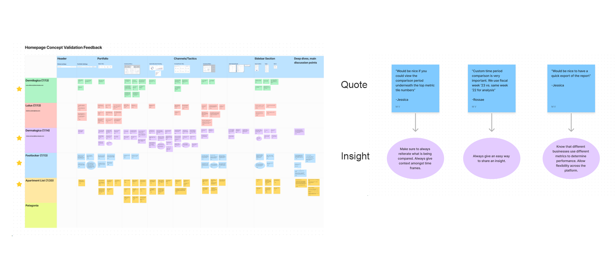
After finalizing the design, I showcased the prototype to six representatives from current and potential clients, as well as our internal Customer Success team, to ensure it effectively met their needs. I actively conducted and participated in user validation sessions, gathering feedback and documenting key insights to further refine the experience.
lessons learned
The dashboard shipped to production and went through multiple rounds of iteration/addition (My Customers Section + Executive Summary Email Newsletter) based on real user feedback, strengthening both clarity and adoption. I found that providing context around data was key to delivering value, with success measured by a reduction in Customer Success tickets related to data interpretation. Upon launch, the product was featured in Yahoo Finance and AdExchanger, with BusinessWire offering a detailed breakdown in their analysis article.
.jpg)